VeckaJul 2026 to now8 min read
Vecka, the workspace I kept rebuilding until it became a product
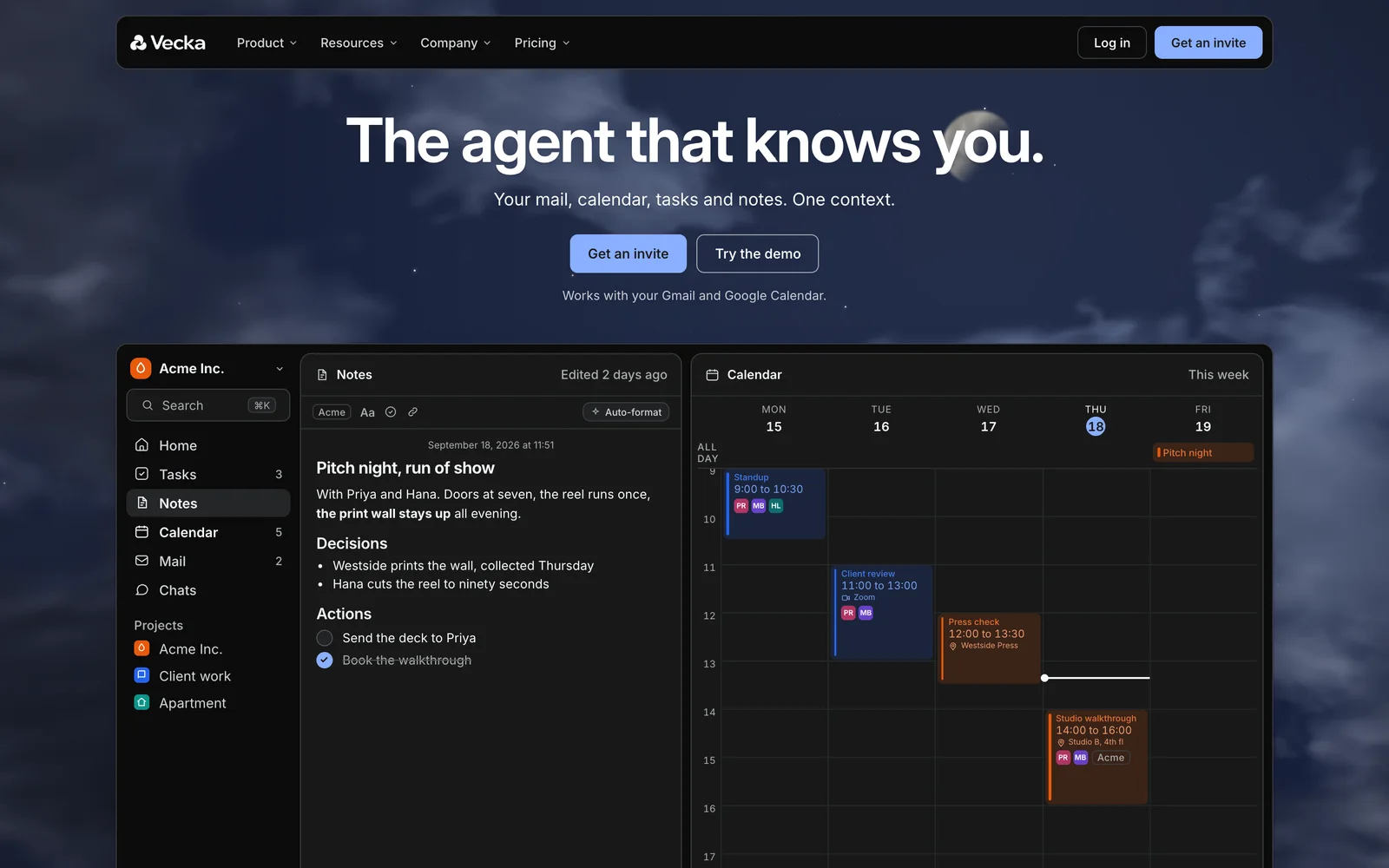
I founded Vecka and I am its only builder. It started as a module of my personal dashboard and became a live React and Node.js workspace with tasks, notes, Google Calendar, Gmail and an assistant that edits through the same actions I do.
- Role
- Founder & Product Engineer
- Period
- Jul 2026 to now
- Team
- Founder and only builder
- Stack
- React 19, TypeScript, Vite, Node.js, SQLite, Gmail and Google Calendar APIs, Caddy on a self-managed VPS
- AI in the loop
- Claude Code and Codex to build, OpenAI API inside the product, Playwright agents to verify
01 · Why
I kept rebuilding the same tool for myself
Vecka did not start as a startup idea. It started as the thing I kept rebuilding for myself. The first version was a Next.js finance hub. In June 2026 I rewrote it from scratch and opened the brief with one line, a central dashboard for me personally, rebuilt clean. The core of it was my own task system, modelled on how Things works, because I wanted to understand the model well enough to build it rather than depend on it.
By late July that dashboard ran on my own server at daviddn.cloud, with tasks, a calendar and mail as modules beside everything else in my life.
On July 31 I looked at the workspace module and decided it was the part worth more than a personal tool. I pulled it out as its own product. The first job was to strip out everything that was mine, the server panel, my name, my data, and replace it with a fictional person and a fictional week, so a stranger could open it and see a product instead of my life.
On August 26 it moved to vecka.ai under one name. Vecka is Swedish for week. I later dropped the tagline about your week, because nothing in the product stops at a week, and settled on the one it has now, everything you are working on, in one place.
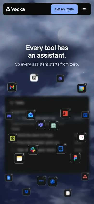
The bet is simple. Every tool I use now has its own assistant, and each one only sees its own slice. The to-do is in one app, the email that created it is in another, the meeting it depends on is in a third. If they share one window, the assistant can see all of it, and so can I.
A central dashboard for me personally, rebuilt clean.
My kickoff brief for the dashboard rebuild, June 2026
A central dashboard for me personally, rebuilt clean.
02 · Split screen
Two apps side by side, moving like one surface
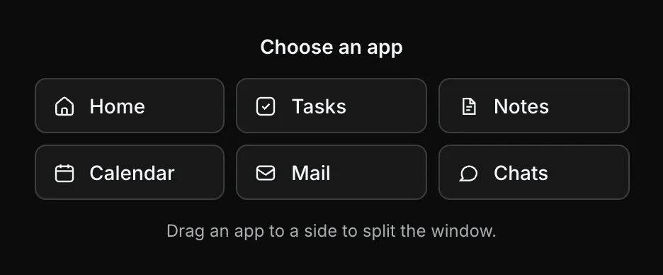
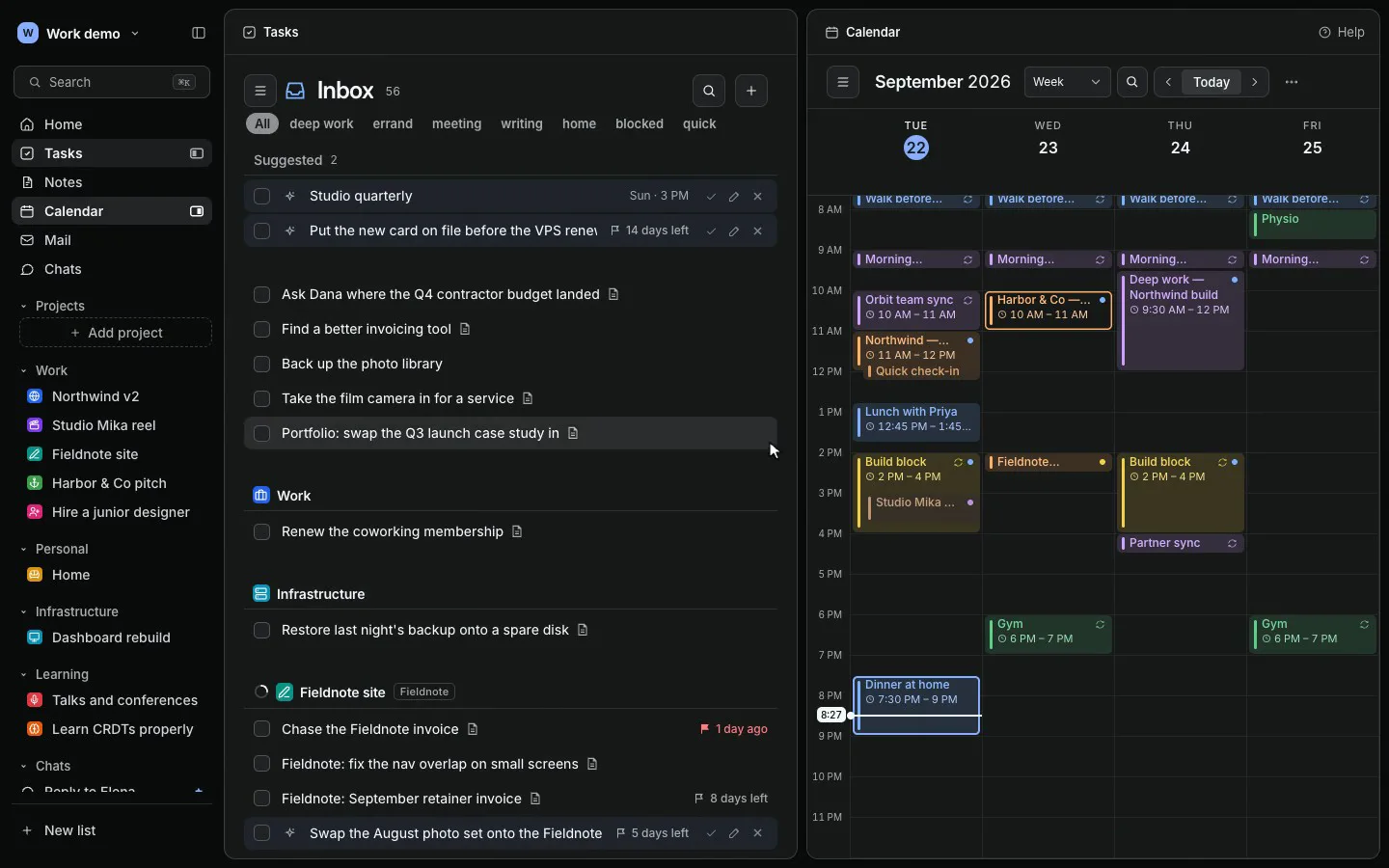
The first product decision was the layout. Tabs hide context, so Vecka shows any two apps side by side. You can right-click an app in the rail and open it left or right, drag a page by its title to one side, or pick an app for an empty half.
I cared about how it moves as much as what it does. When a pane opens, each side holds its content at the width it will land on, so nothing reflows while it travels, and the old layout dissolves into the new one.
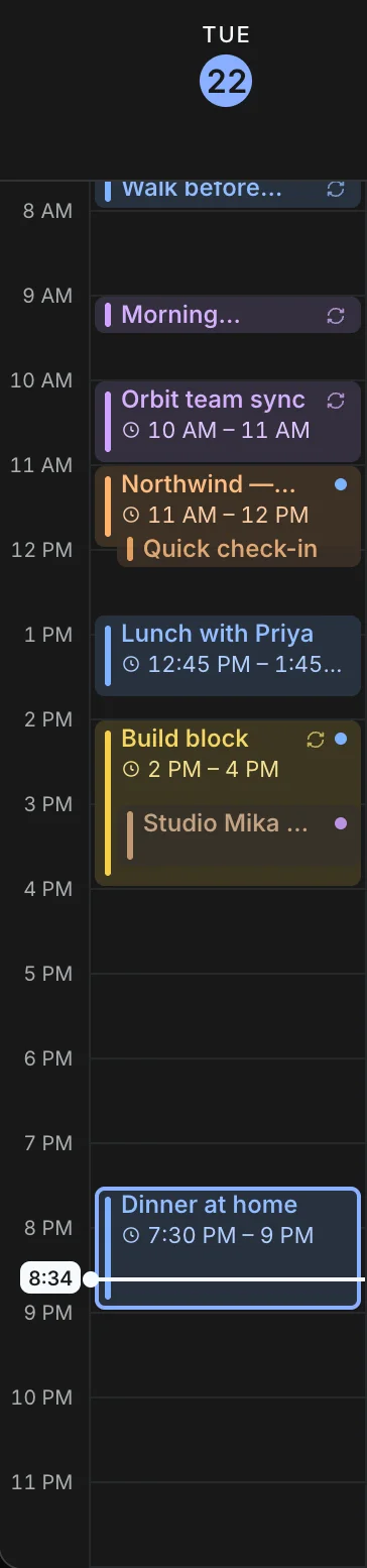
The calendar was the hardest part. An early version could show half of a day at the edge of a narrow pane, which reads as broken. I set a rule and rewrote the layout to hold it. The pane is shared among whole day columns that clear a 120 pixel floor, and the last column ends exactly at the edge.
Then I profiled a two second divider drag in Chromium. 1.8 seconds went to raster, ten times any other pane. Drawing the hour rules as a repeated one pixel tile instead of a stretched gradient cut raster to 550 milliseconds. A per frame follow that costs one width read and two writes took the partial column during a drag from 13 to 101 pixels down to 0 to 2.
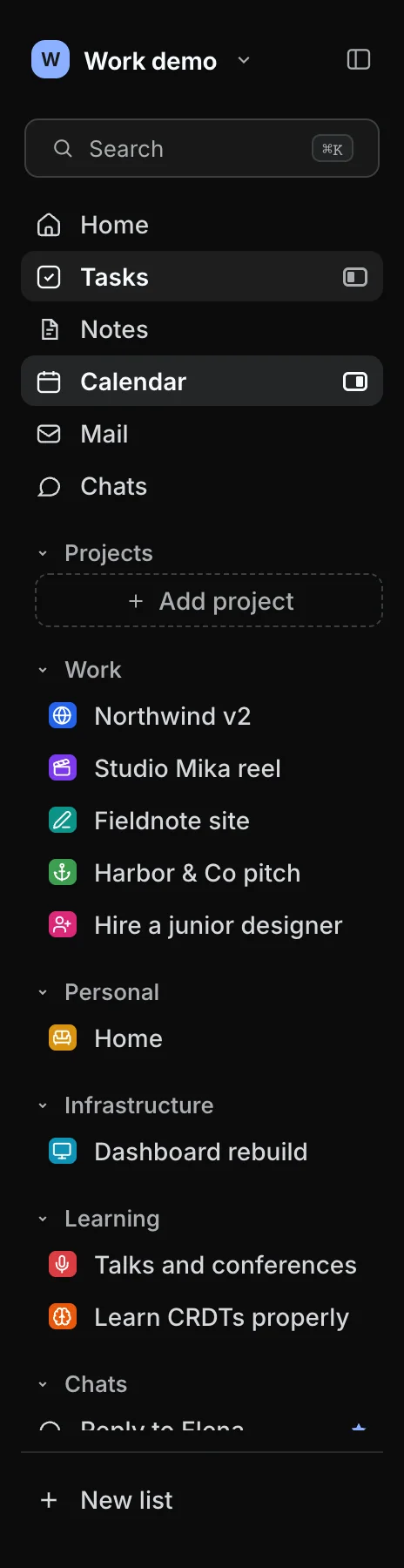
The empty half needed a job too. Dragging a page by its title splits the window and leaves a picker in the other half, and the rail marks which app sits on which side.
- raster in a two second divider drag
- 1,344 to 550 ms
- hour rules drawn as a one pixel tile
- partial column per frame
- 13 to 101 px, now 0 to 2
- one width read and two writes per frame
- minimum day column
- 120 px
- the pane is shared among whole days only
03 · Projects
Projects as the spine across Tasks, Mail and Calendar
The second decision was structural. A project in Vecka is not a folder inside one app. Mail threads are filed to it, events belong to it, to-dos sit under it, and every surface draws the same short tag, like NWv2 or COMP 210.
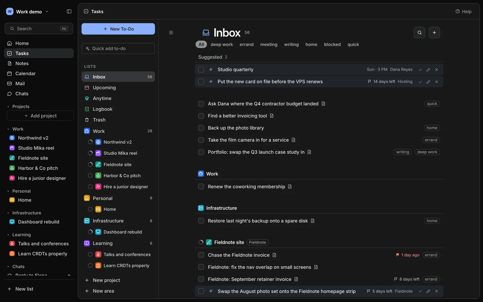
The project page is where that pays off. It opens with what is due next, the next event and unread mail, then the tasks under their headings, a one week agenda, the filed threads and the notes.
I kept filing deterministic wherever I could. A suggestion is matched to a project by its sender and subject against the open projects’ tags and names, never by reading the body, and a model is only asked when that match is unsure. In that lane 61 percent of verdicts need no model call at all.
The spine only works if the apps underneath are real. Mail is a full Gmail client with rich bodies, compose and true send, and full history lives in per workspace SQLite archives. When I moved to that design I checked all 3,697 original messages against the working set plus the archive and found none missing.
The calendar syncs every Google calendar and edits Google events natively, but it is local first. An event added while Google is busy or disconnected stays on the grid and waits in a queue, instead of vanishing.
04 · Suggestions
Suggestions you approve, edit or dismiss where you work
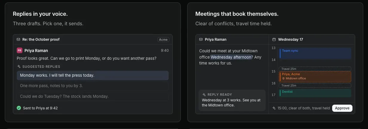
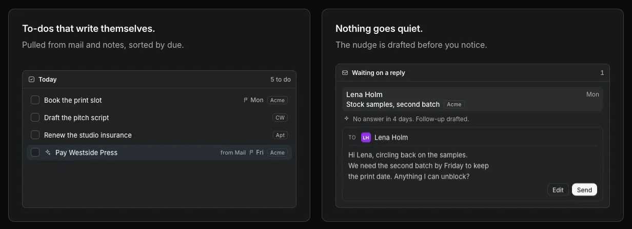
With consent, Vecka reads incoming mail and proposes to-dos and calendar blocks. My first version drew them in a strip above the list and it read like a notification feed. I made each suggestion a row of the list instead, the same shape as a to-do on a light blue wash, with the checkbox as Approve.
Nothing lands in the list or on the calendar without that click.
Every row carries approve, edit and dismiss. Edit opens a card with the deadline, a project picker and a line back to the email it came from. An edit is saved onto the suggestion, so it stays a suggestion until approved. The deadline flag counts down in days, turns red on the day, and switches to hours when the to-do has a time today.
The list itself had to feel physical. Rows reorder with a live drag. The carried row lifts as its own copy and the rows below slide one row out of the way. The gap kept flipping every other frame until I measured geometry from rest positions at the lift instead of from boxes in mid transition.
05 · Assistant
An assistant that edits through the same actions I do
The decision that shaped the assistant is that it never writes to the data directly. Its edits run through the same client-side actions as my clicks, so every change it makes lands in the same undo history and comes back out the same way. The model proposes, the product applies.
Anything that writes appears first as an approval card that states the change in the product’s own terms. If I switch conversations mid turn, the turn is parked with its open cards and resumes when I come back, so an approval is never silently dropped.
Responses stream over server-sent events, with the tool work drawn above the answer. Every call goes to an append-only usage ledger priced per model, and an operators’ portal shows spend, tokens and cache hit rate. Splitting the prompt into a cached system part and a per turn context part keeps repeat calls cheap.
I pick the model per task by cost and fitness. Chat titles moved to a smaller, cheaper model, while the assistant stayed on the stronger one.
Mail gets stricter rules. Emails are treated as data and never as instructions, no subject or body is ever logged, and every AI feature over mail sits behind one consent switch. Vecka asks Google for gmail.modify and never for full mailbox access.
06 · Front doors
A homepage and a demo that show the product instead of describing it
vecka.ai used to redirect straight to a sign-in card, so a stranger learned nothing. I gave it a homepage on September 15 and rebuilt it several times in a week, each time closer to showing the real product.
The version live now is one pinned scroll stage. Fourteen real tool marks float in depth, then curve into one point, and the Vecka window fills in behind them.
The hero window is a faithful miniature of the app, drawn from the real screens’ measurements, and it walks its apps once with the product’s own pane motion. I ported the page to React components, prerendered at build time. Full React DOM put the largest paint on a mid tier phone 348 milliseconds behind the static page, so the browser runs the same components on Preact, which brought it level.
The mark changed twice. I turned down a letter in a tile early and drew a V instead. In September I explored three symbol directions and picked Gather, three rounded forms around an open centre, because it kept its opening clearest at 16 pixels.
The public demo is the second door. A visitor types a first name, picks one of four personas, and lands in a full workspace seeded with 40 to 70 records per module, dated relative to the moment they arrive. The rule I hold myself to is that every feature ships with its demo data in the same change.
07 · How I build
Shipping with agents, and a gate I do not skip
I build Vecka with Claude Code and Codex. My job is the product call and the review. I write the direction, agents build on a branch, independent critic agents review the result, one writer applies the fixes, and I look at it on the live URL before it counts. When the work does not meet the bar, I say so and it goes back.
The rule that keeps this honest is the gate. Every deploy installs, typechecks, runs the unit suite, builds, runs the browser suite against an isolated copy that cannot reach real data, ships, then signs in with a throwaway account to check the live app.
Agents also do the looking. One pass photographed every surface at widths from 1920 down to 320 pixels, then fixed the shared system for phones with a bottom tab bar, sheets and 44 pixel touch targets. Real Playwright in a real browser verifies each change, because a preview pane that never paints once let a real bug ship.
Speed has a cost, and I paid it. On September 12 a cleanup step in my own deploy tooling expanded an unset variable and deleted the account store. I restored it the same night from a backup plus 3,426 intact documents recovered from the raw disk.
Then I made sure it could not happen quietly again. The store takes a verified snapshot every hour, a deploy refuses to ship without one under a day old, deletes under the store are refused on the box, and the server will not boot if the account count falls below half of the last boot.
| Date | Milestone |
|---|---|
| Jun 16, 2026 | Dashboard rebuilt from a clean brief, with my own task system |
| Jul 31, 2026 | The workspace module becomes its own product |
| Aug 25, 2026 | Production serves the React app, Google sign-in |
| Aug 26, 2026 | The assistant launches, the product becomes Vecka on vecka.ai |
| Aug 31, 2026 | Mail assist and the public demo at demo.vecka.ai |
| Sep 11, 2026 | Projects become the spine across apps |
| Sep 12, 2026 | Store restored the same night, four guard layers added |
| Sep 15, 2026 | Homepage, suggestion rows, live drag to reorder |
| Sep 22, 2026 | Split motion, a calmer project page, the homepage in React |
08 · What I learned
Building for one person first, and then for a stranger
The biggest change in me was the audience. For months I built for exactly one user who knew where everything was. Making it a product meant a stranger had to open it cold and understand it, which is why the demo, the seeds and the homepage exist at all.
I also learned that motion is part of the product. Most of the passes on the split screen and the calendar were not features. They were the difference between an interface that jumps and one that holds still while you work.
The honest part is that Vecka has no users yet beyond me and demo visitors. Agents made output cheap, which made it easy to skip the question of whether a change mattered. So I now write the goal and what would prove it before I start. Next are Google verification, which lifts the cap and weekly expiry on an app in testing, and shared workspaces for teams.
Archive